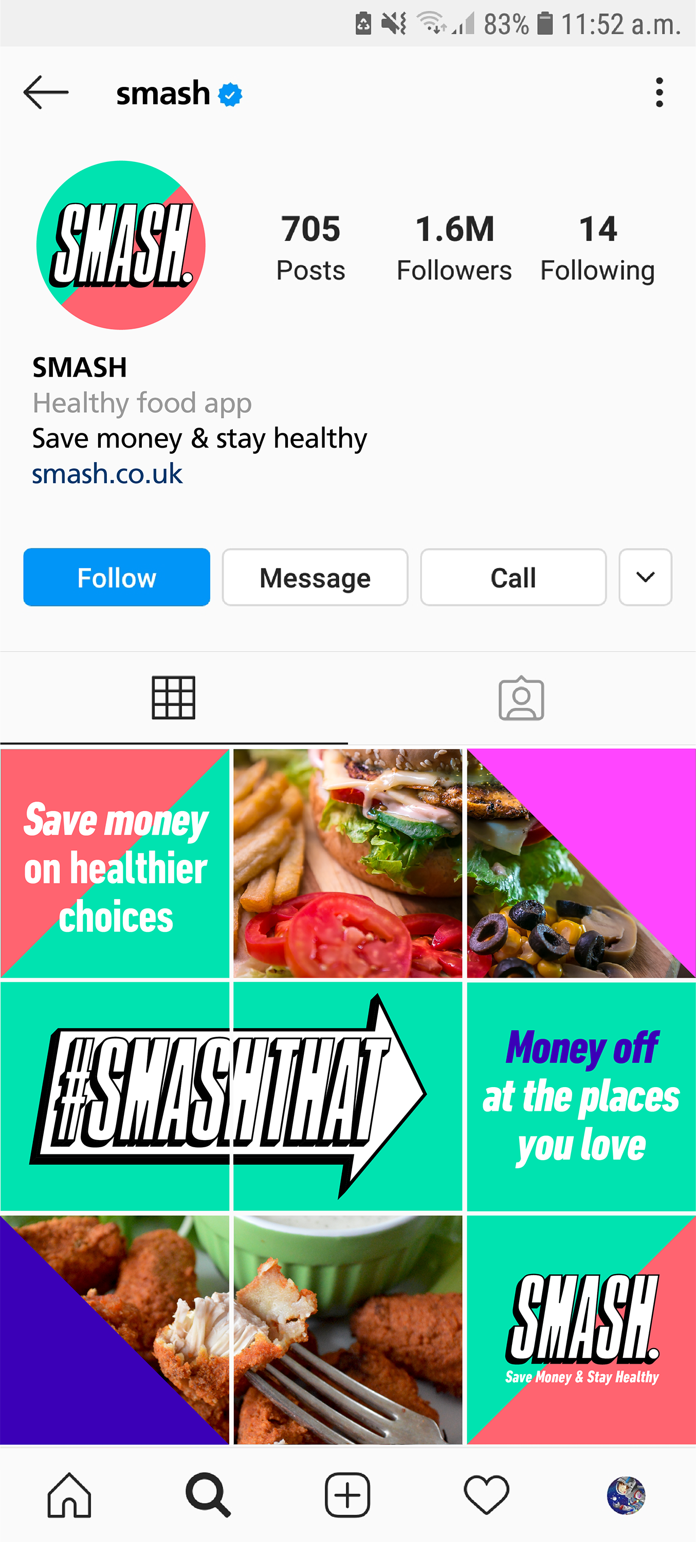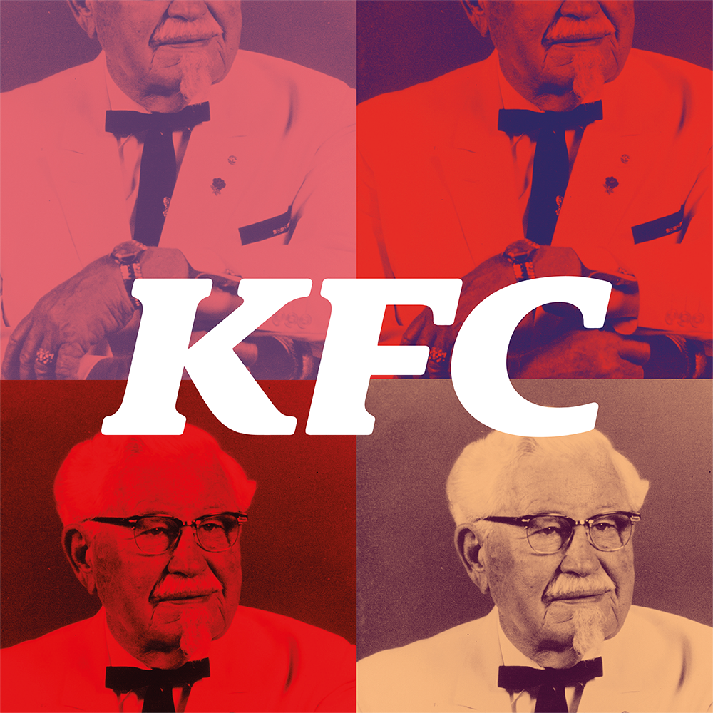
SMASH (Save Money and Stay Healthy) is a healthy food app designed to increase access and affordability of healthy food for every young person in the UK, and help solve the childhood obesity crisis. SMASH offers discounts from well known restaurants (think KFC, Subway, Itsu) on their healthiest options. I was part of the team that was asked to create a visual identity for this new brand.
Besides the work on the visual identity design, I created loads of small animations using After Effects for social media (TikTok, Instagram) – which I always enjoy doing! – and worked on the web design to create a small one page sign-up website which was a great new experience.
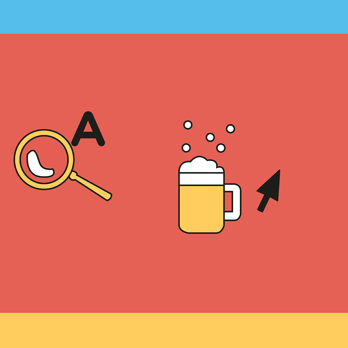
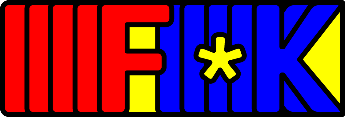
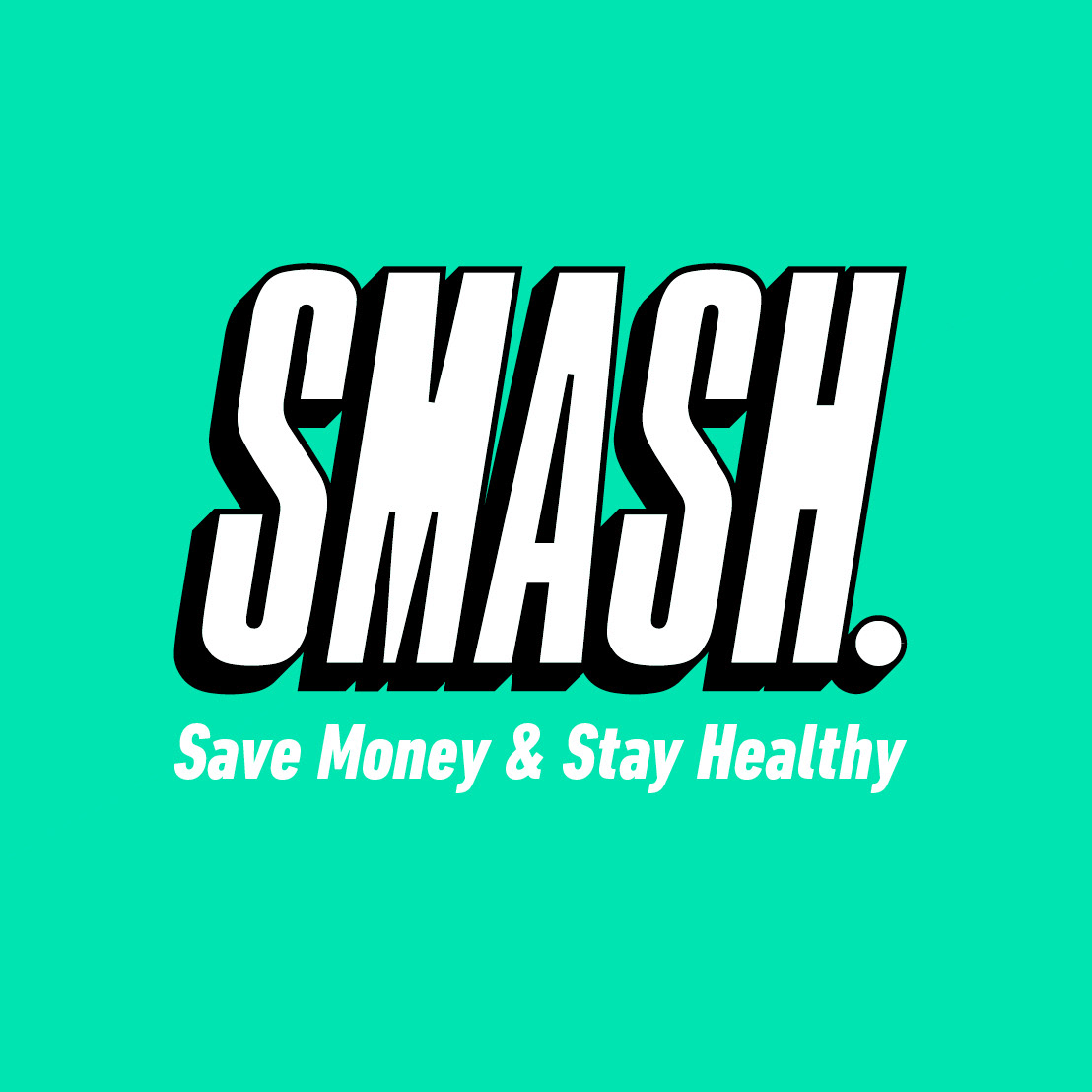
Logo initial concept design
On this project I worked together with 1 other graphic designer, and for the initial concept stage we both created 1 design route each. The following few images are of the route I worked on, with our design routes coming together (a classic Frankenstein) at the final design stage.
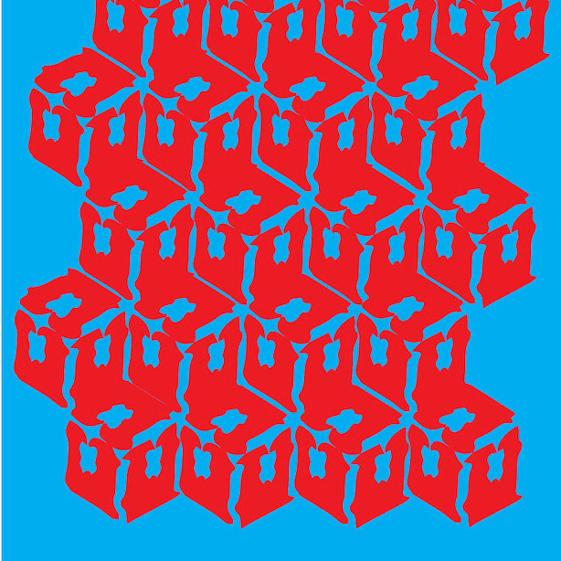
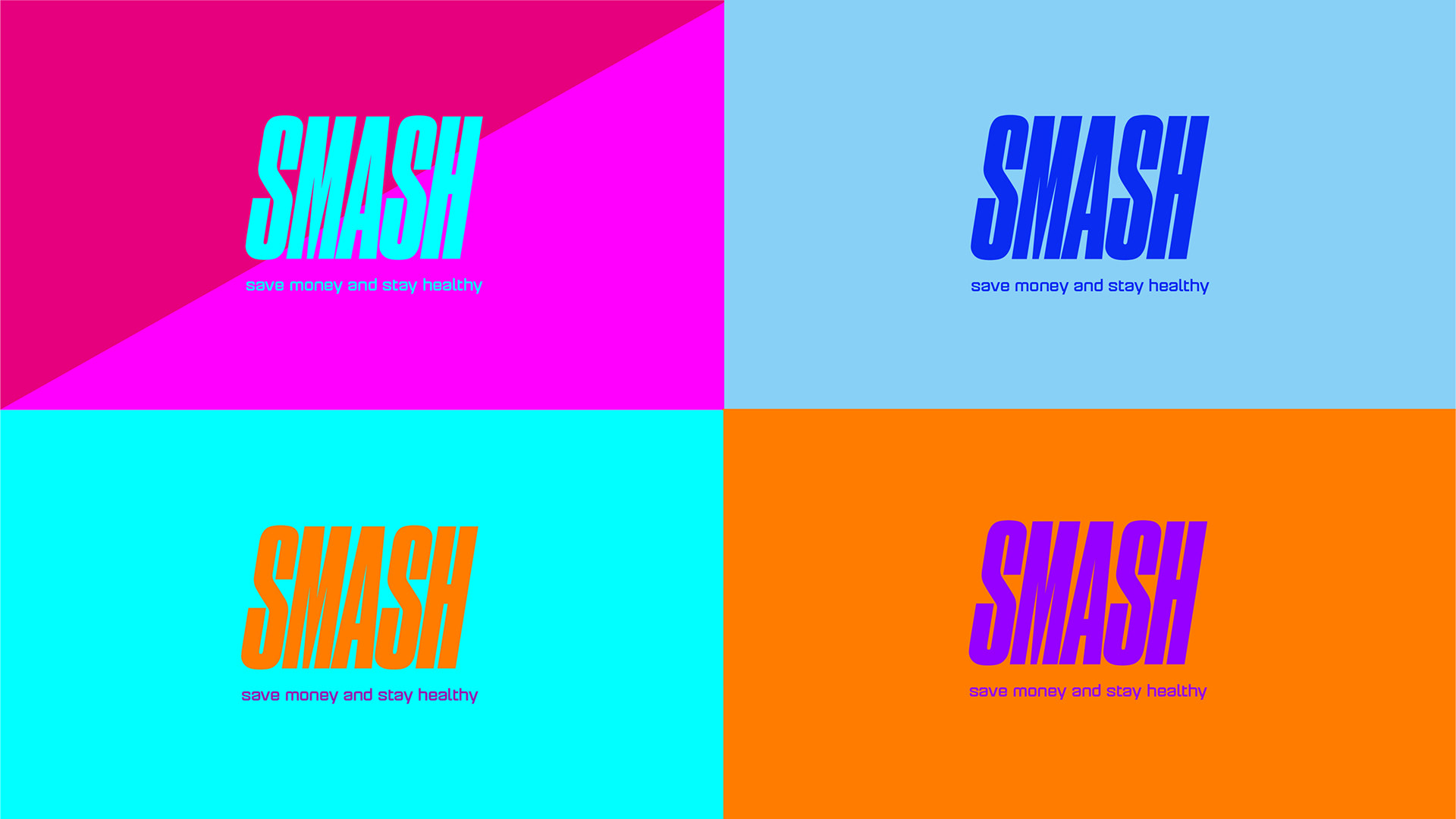
I picked this logotype because its "smashed" together look works well with the brand name, and used bright colours that
appeal to the young target audience. In the communication I looked at the concept of ‘choice’ and visualised this in the dual-toned diagonal shapes.
appeal to the young target audience. In the communication I looked at the concept of ‘choice’ and visualised this in the dual-toned diagonal shapes.
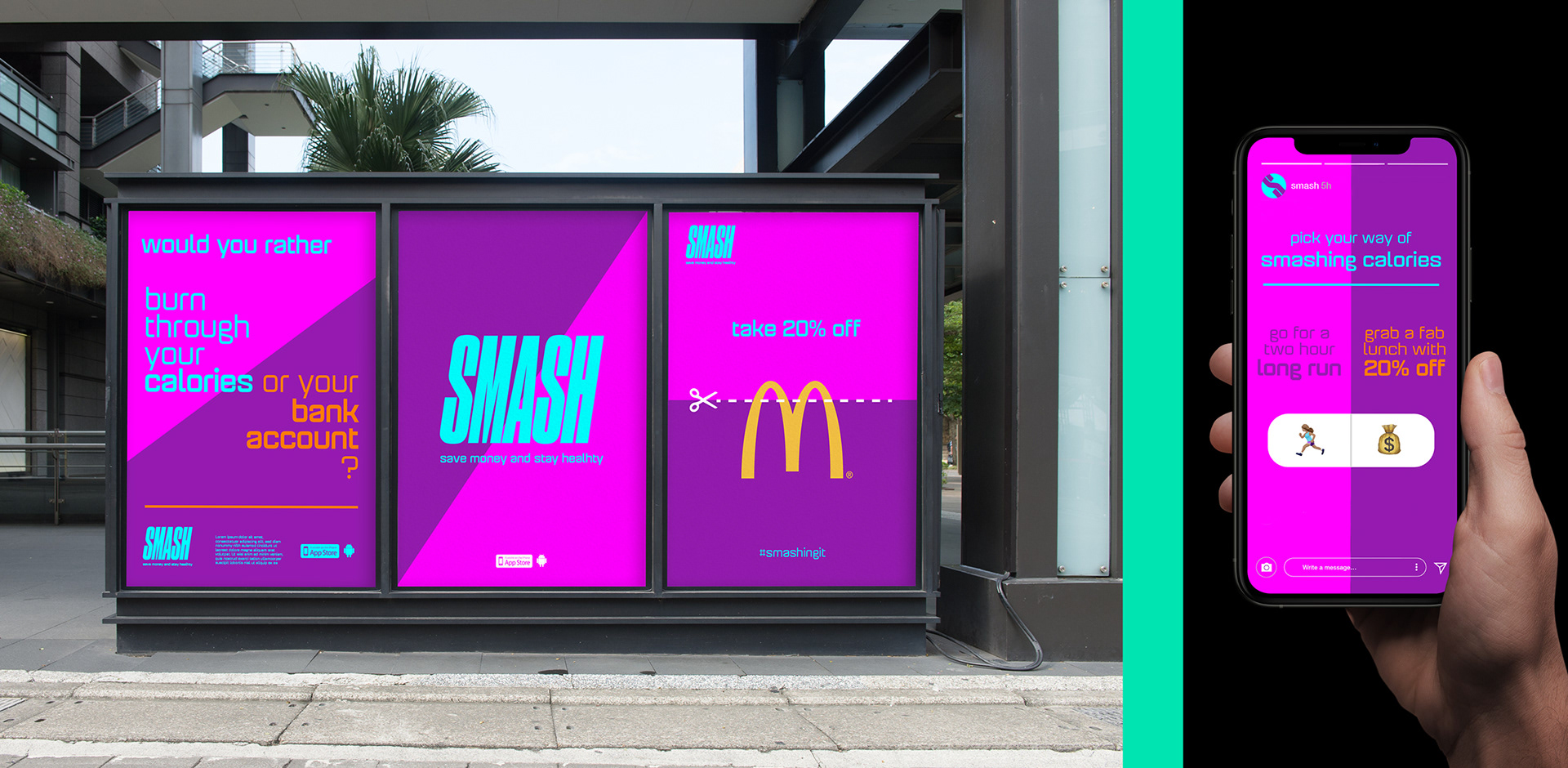
Initial concept design for print and digital / Instagram
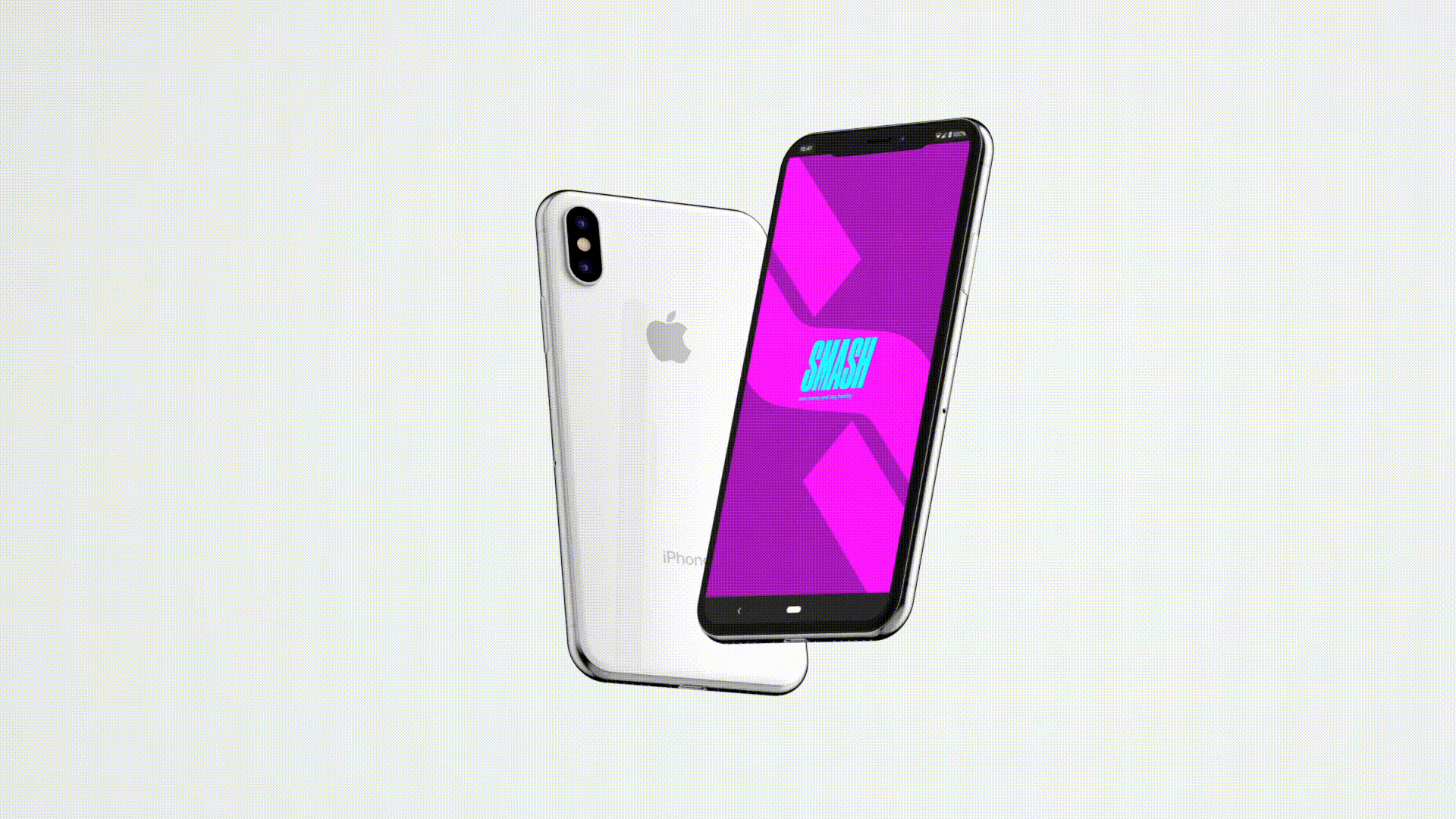
Initial concept app design
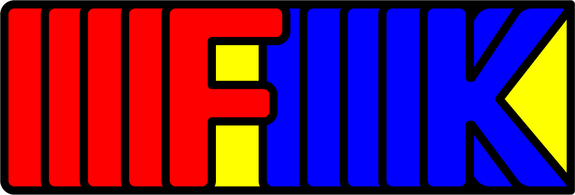
Final logo design after multiple iterations / social ad design

Design for Instagram grid, and a simple sign-up website